August 11, 2025
You can have the most brilliant ad campaign in the world, but if it drives traffic to a weak landing page, you're not just losing leads, you're burning money.
Think of your landing page as your best salesperson. It works 24/7, and its only job is to turn a visitor into a customer. It needs to be clear, persuasive, and relentlessly focused on a single goal.
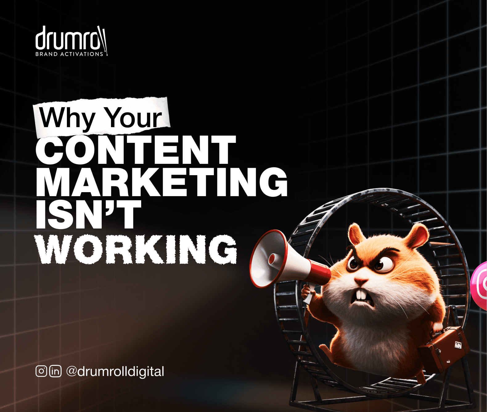
Many websites leak money because their landing pages are treated as an afterthought. We're going to dissect the anatomy of a page that converts, breaking down the essential elements that separate the performers from the failures.
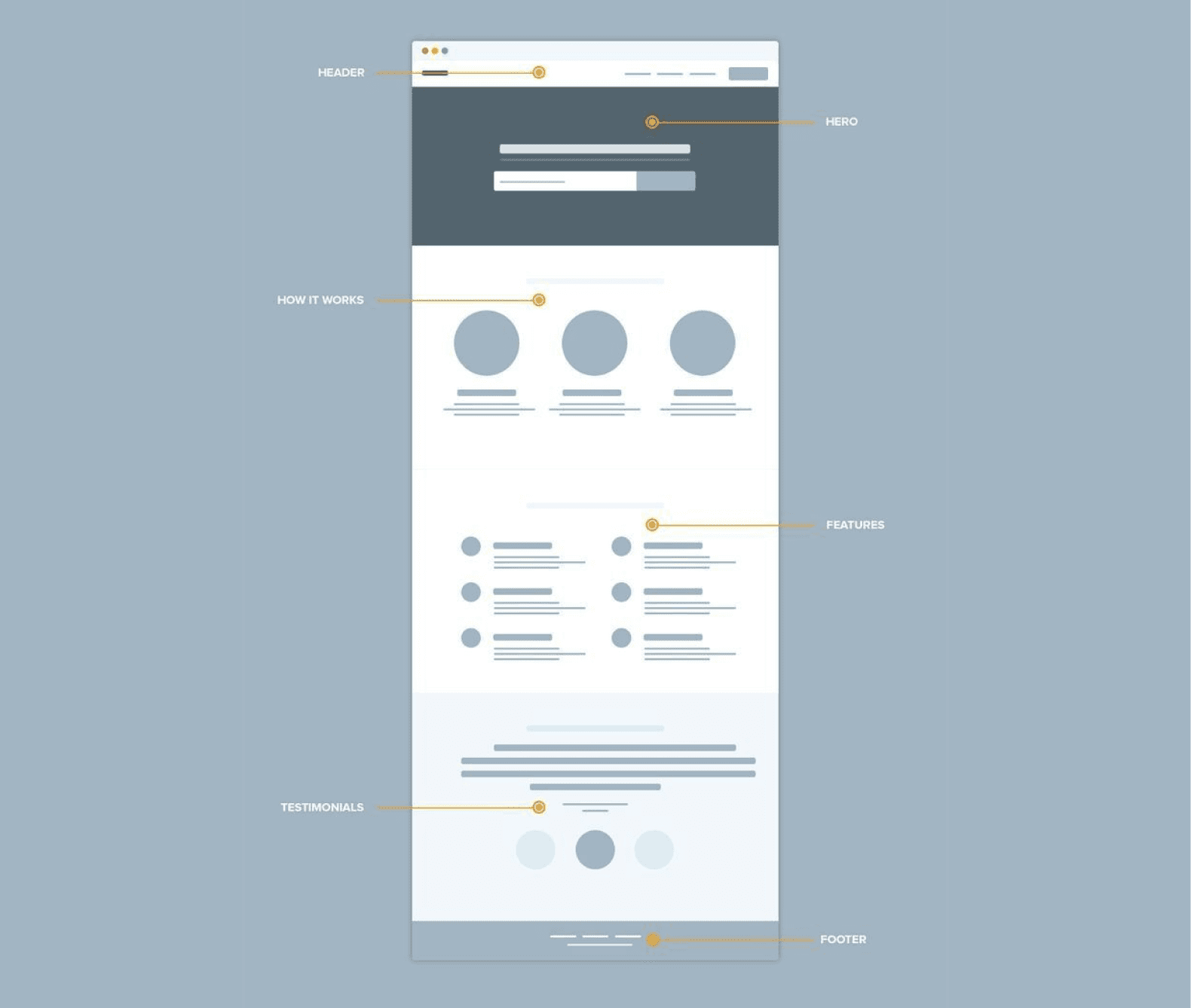
Section 1: The One-Second Test - Your Headline & Hero
A visitor gives you about one second to convince them they're in the right place. Your headline and the "hero" section (the first thing they see) have to do the heavy lifting instantly.
The Headline: It must be ruthlessly clear and benefit-driven. It shouldn't be clever; it should be effective. It needs to immediately answer the visitor's question: "What's in it for me?"
Bad: "Synergistic Marketing Solutions"
Good: "Get More Customers From Your Website"
The Hero Image/Video: The visual must support the headline's promise. It should show the product in action, represent the successful outcome, or feature a relatable person. It's not just decoration; it’s a critical part of the argument.
Section 2: The Argument - Persuasive Copy & Social Proof
Once you've passed the one-second test, your visitor is willing to scroll. Now you have to make a compelling case.
Benefit-Focused Copy: Don't just list features. Translate features into tangible benefits. No one cares that your software has an "AI-driven algorithm." They care that it "saves them 10 hours a week." Write for scanners: use clear subheadings, bullet points, and bold text.
Irrefutable Social Proof: This is your trust-building arsenal. People believe other people. Use direct quotes from happy customers, logos of well-known companies you've worked with, and data-backed case studies. This isn't bragging; it's providing the evidence a skeptical buyer needs to feel confident.
Section 3: The Ask - The Frictionless Form & Call-to-Action (CTA)
This is the moment of truth. You've made your case, and now you're asking for the conversion. Don't trip at the finish line.
The Form: Keep it as short as humanly possible. Every extra field you add reduces your conversion rate. Only ask for what is absolutely necessary to take the next step.
The Call-to-Action (CTA): The button copy should be specific and reinforce the value.
Weak: "Submit," "Download"
Strong: "Get Your Free Demo," "Create My Marketing Plan," "Start My Trial"
Section 4: The Post-Conversion - The Thank You Page
Most businesses waste this critical step. The "Thank You" page isn't just a confirmation; it's the beginning of a new relationship. Use this opportunity to:
Instantly Deliver the Asset: Provide the link to the webinar, e-book, or resource they just signed up for.
Set Clear Expectations: Tell them what happens next. "We'll be in touch within 24 hours to schedule your demo."
Guide Them to the Next Step: Suggest they follow you on social media, read a relevant case study, or watch a product video.
Every element of your landing page must work in concert toward a single goal. If your pages are a leaky bucket, you're leaving revenue on the table every single day.
If your pages aren't performing, we can help. Our High-Conversion Website & Landing Page service is designed to do one thing: turn your traffic into customers. Let’s make your website your best salesperson